Friday 9 December 2016

Character and Narrative - Limitations in Aesthetics

As far as I can tell the one true limitation of hand drawn animation is the ability (or lack of) to portray realistic depth within a shot. This limitation is based on the fact that, even when utilising parallax effects, it is nearly impossible to achieve a truly three-dimensional looking space in the same way that CGI can. With CG animation the lighting and shading effects alongside imitation lens and motion blurs can give an effect of the third dimension that is almost as real as if it were live action film. In contrast to this, while not technically impossible, it is beyond the reach of any human being to draw and animate a scene that could closely imitate reality in the way 3D animation can.
I see this as the main limitation for traditional animation, and is one of the reasons 3D and digital animation has so many more uses - particularly for 3D which can now be seamlessly edited into live action footage, or used to create entire scenes and backdrops for actors to be placed in. Compare this to the look of Space Jam which while obviously very cartoony and unrealistic, still wasn't able to make Michael Jordan look like he was actually a pat of the scene, rather than just plonked on top of a hand drawn animation.


Character and Narrative - Traditional techniques in modern animation

Traditional techniques may be slowly being taken over by modern digital animating techniques but I think there will always be a place for traditional animation as a tool for getting to grips with the basics and solidifying the 12 principles. Even something as simple as animating a pendulum swing, a bouncing ball or a basic walk cycle is an invaluable step in learning the principles before moving on and applying them to a more specialist type of animation. There is no quicker or more accessible form of moving image than the flipbook - possibly the fastest tool an animator has to share an idea or concept, and while I don't think it is strictly necessary for an animator to be able to draw well (especially animators in the CG field) I think traditional techniques such as the line test will not go out of fashion as a quick way of previewing and tweaking with the timing of a shot or scene.

Thursday 8 December 2016

Character and Narrative - Texture in Traditional animation aesthetic

I have noticed a trend in lots of recent digital animation - applying textures to reduce the bland flatness of digitally coloured images. One example of an animation I think utilises this technique well, and for a number of reasons, is Drawing Inspiration directed by Wesley Louis and Tim McCourt. Whilst many background elements are actually painted in watercolour the character and prop animation is drawn and coloured digitally. Not only would these elements look anachronistic against a painted background, but the cartoony style of the characters could easily make it look playful and exciting - unlike the quite morose mood of the piece. The animation focuses on an alcoholic magician, and I think due to the slightly more mature themes portrayed in the film it would have looked weird if the art style used flat colours. It seems like for many animators who want to make films for adults, adding textures is a shorthand aesthetic cue which separates their work from children's cartoons.
In my own work I have used it as an alternative to line boil when a scene looks like it will appear to flat and lifeless, an animated texture can bring a bit of movement.

Another reason I think this trend has come about is due to a much wider movement in art away from digital techniques and towards more analogue or handmade aesthetics. I think this is due to some new snobbery about digital art now that it is so easy and cheap for the general public to create and publish their work. Maybe it is subconscious but I believe society or at least the art world is placing a renewed emphasis on the handmade, and this has resulted in the increased use of simulated paper textures, analogue noise and other overlays to add texture and depth to a flat image.
I used a similar technique during my "The Other Side" animation at level 4 - overlaying scans of old newspapers to break up the boring flat look of the animation.

Cartridge paper texture applied in Drawing Inspiration
Newspaper texture applied in my animation

Character and Narrative - Aesthetics

Traditional animation has possibly the most scope of all animation techniques in terms of aesthetics. Essentially the term "traditional animation" covers all forms of drawn or painted animation, and is therefore open to any style or aesthetic that can be physically produced in a 2D format and photographed. This can range from very simple black and white stick cartoons like the work of Don Hertzfeldt, to the incredible oil-painted production of Loving Vincent in the style of Vincent Van Gogh's paintings. Traditional animation might be the most versatile in terms of aesthetics, and compared to the last 25 years or so of mainstream 3D animation the range of different art styles in traditional animation is vast.
When you look through the history of traditional animation the aesthetics are often linked closely to a social or artistic movement of the time. The very early commercially produced animations such as Flesicher Studio's PopEye the Sailor and Betty Boop films strongly resembled, and were often based on, the newspaper cartoon strips of the time. This aesthetic style was later developed on by Warner and Disney in their shorts, and when Snow White was released in 1937, Disney's aesthetic became the go to for fairy tale type stories for the next 30 years. Later in the 60s counterculture style infiltrated animations such as Fritz the Cat, based on Robert Crumb's pulp comic strips, and Yellow Submarine which drew heavily on the hippie movement aesthetic of the work of Milton Glaser and Heinz Edelmann.
These days we have the ability to look back on and borrow from the entire history of animation thanks to the internet and the instant accessibility we now have. This has allowed animators these days to imitate and reference, and broaden the aesthetic possibilities further.

Wednesday 7 December 2016

Character and Narrative - Time/Budget Restraints & Limited Animation

30 seconds at 24 frames per second = 720 frames (or 360 on twos), a scary proposition for someone deciding to do traditional animation, especially if you don't like drawing digitally. I decided to use "limited animation" a time and money saving technique used throughout the history of traditionally drawn animation. Limited animation is the term used to describe a form of animation which reuses as many assets as possible, which became possible when animators began using transparent mediums such as celluloid or acetate to create frames which could be layered on top of each other and photographed all at once. The first major change this brought about was that the animators no longer had to draw the background in every single frame. One single background could be photographed below all the animated frames. When Winsor McCay animated Gertie the Dinosaur in 1914 the background was drawn anew in every single frame, compare this to his film The Sinking of the Lusitania produced four years later, which made use of layers of transparent cels layered above oil painted backgrounds.
Thanks to these new technologies it also became possible to animate individual characters separately, again allowing frames to be reused when certain characters weren't moving within a scene. This was later increased to using separate cels for separate moving parts on the same character, a good example of this being the Beatle's Yellow Submarine movie, in which many scenes are entirely static other than a single arm movement or a foot tapping to the music. In fact it was thought by King Features who produced the film that the film would have been impossible to make had they not used such limited animation (at the time of production no studio other than Disney had been able to produce a feature length animation without going bankrupt in the process).
These days with digital production techniques it is very easy to animate separate parts of a scene individually, and in my own production for Telling Tales I used Photoshop to repeat frames throughout the film.
The main issue I see with limited animation is a very flat and lifeless look in scenes in which there is little movement. Some easy tricks to make things look less dull are making static background characters blink every now and then, or producing line boil. "Boiling Line" means a wobbly look applied to outlines, normally by repeating a two or three frame loop which gives the illusion of movement. There are some plugins available for programs like Flash and After Effects which apply line boil to digital animation, but in my production I drew two frames for every still image to keep my character looking alive, and make the car look like it was being vibrated by its engine.

Character and Narrative - Evaluation

I really struggled to engage with this module, and felt thoroughly unmotivated and disinterested by both the set briefs and my own responses to them. The work I produced for Telling Tales was worse than mediocre - a dull story and visually very uninteresting. I find myself falling back on making work that I find easy to do when I am not interested in the brief or in my own ideas, and Road To Nowhere is an example of feeling like it wasn't possible to play or experiment within the confines of the brief, therefore resulting in a very safe and ultimately uninspired piece of animation.
Normally I find the process of animating much more satisfying than the end product itself, and am not usually worried about the outcome so much as the experience of making the work - but during Character and Narrative I found it a drag even to think about working, and have been more than happy to distract myself with less urgent business for COP or other modules. After the suggestion last year that changing projects to a more interesting idea after getting underway with another one was a waste of time, I spent a long time resisting starting work on a project I was not at all stimulated by, probably wasting more time in the process. I still believe that, as I am a confident and quick animator, my time would be better spent on long consideration of a project before getting underway with the work. I have often felt like there is a pressure or a rush to have settled on a story or project by the end of a briefing session, and I don't think that for me it is conducive to coming up with my best ideas.

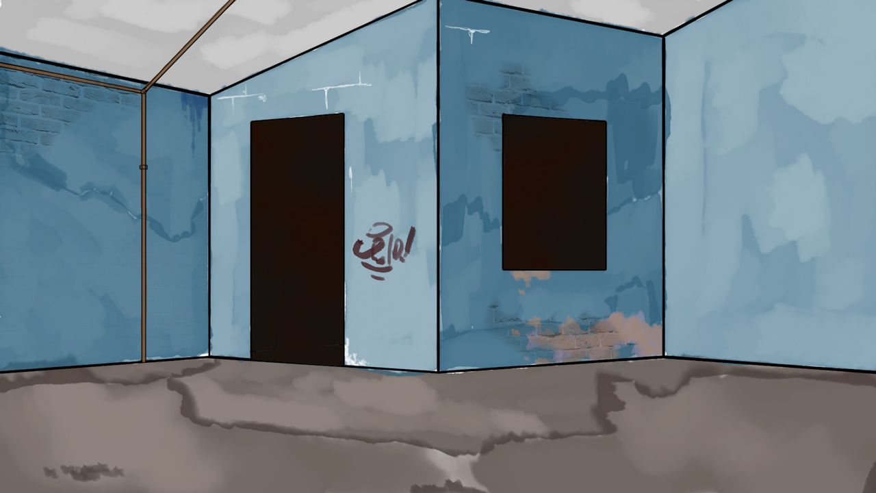
In terms of the technical side of the Telling Tales animation, I consider the hand drawn elements to be a step down from work I have produced in the past, in fact there was very little actual animation involved, almost exclusively using line boil to bring life to a flat image. In the one scene in which I attempted to draw multiple frames (when the car drives off into the horizon) the animation is jerky, and the volume and shape of the car seems to warp and shift between frames.
Regardless of this I think that there were some small indications of a more interesting animation lurking under the surface of my Road To Nowhere. Had time constraints not played such a big role in my decisions about what to keep in and what to cut out of the film I would have liked to have seen more use of collage/montage and texture through the scanned elements.
Maybe the single achievement of the production of this piece is a growing familiarity with the intricacies of After Effects. I was able to very quickly transfer my knowledge of other Adobe software, particularly Photoshop, and through the use of adjustment layers, blending modes and effects was able to precisely tweak the look of the film, and to make sure each scene looked the same as the others, despite having been drawn with a range of pens on a range of papers.

I enjoyed playing with the puppet pin tool, mainly due to its speed, although I can't see it being massively useful to me. Similarly DUIK seemed like more effort than it is worth. The time taken to build the puppet in Photoshop, tweak the anchor points and positioning in After Effects and then rig it in DUIK seems excessive considering the limitations of the medium. I think in both cases I would prefer to use cutouts or traditional style animation. Both alternatives would allow me more control and a wider range of possibilities.

Strike A Pose was a fun exercise. I enjoy positioning and posing the puppet in Maya, but not building or rigging. Potentially I would like to try animating in Maya, in collaboration with someone who could provide the rigs. I found MOOM to be a bit of a fiddly character to manipulate, but was pleased with the facial expressions I managed to get out of him, if not so satisfied by the body positions. I found that sometimes looking in a mirror or at reference photos of myself was hard to translate onto MOOM because of the irregular proportions of his body. This is a consideration I will have to bear in mind in the future when modelling or animating in Maya.

In a wider sense I feel like this module compounded my feelings that the way I want to work (still not entirely clear to me) is incompatible with the university set up. I have often felt that the course in general is geared purely towards gaining a job "in the industry", with little to no compensation for those who are interested in animation as an art form (sometimes I forget I am at an "Art School" altogether), and this term has only bolstered those worries. Perhaps I don't want to sit behind a desk pushing a mouse around for Disney or Cartoon Network. Perhaps I don't want to tell tales with a central character and a clear narrative. Perhaps I don't want to write contrived stories which don't interest me just to fulfill the criteria of a brief. Perhaps this course isn't right for me, or I'm not right for the course.

Much soul searching to be done over christmas.

Monday 5 December 2016

Strike a Pose

I think Moom is a rubbish model as you don't have much control over the legs, and I feel that lots of emotion is displayed through the stance. For example I wanted to turn the knees inwards for a cowering stance to indicate fear, but the knee joints don't have their own controls and only move up and down parallel to the body when controlled by the foot movement.
 
Confusion 

Pain

Pride

Sadness

Surprise


Full Blown Puppet Mastery

Let's take a trip to the circus, I hear they have a really sick balancing act.


Look at him go!! Keep watching long enough and he might fall off.

I made the mistake of standing in the position I wanted my puppet to be in, with arms and legs slightly bent, rather than in a T-pose or similar position which would have made the warping of the puppet look a bit smoother and given me more control over the limbs.

I like how quick and easy it is to use the puppet pin tool, but it seems fairly limited in its applications. I'm not sure I can see myself using it for much more than warping and wobbling.

All I wanna do is DUIK

In my first attempt with DUIK I tried to create a rig of a pink elephant with fat stubby legs, and I quickly learned that no amount of tweaking with DUIK's controls, the anchor points or with the separate limb images within the rig would change the fact that stubby limbs don't want to pay nice with DUIK.


I gave up on Nelly the elephant when not only did the joints seem to dislocate and float around improperly, but the knees on the back legs decided to bend in the wrong direction.

I decided to follow a new tack, and thought "Who has really long and skinny limbs?" Giraffes, NBA Players, long distance runners, corpses. Maybe a zombie marathon runner would solve my DUIK woes. Introducing Zomboy:

He knows not why he runs.


Sunday 4 December 2016

Character and Narrative - Week 9

Things have finally come together, and other than a few very minor tweaks to the timing of a couple scenes the visuals are complete. I have started looking online for royalty free sound effects. I want to use a lot of different sounds and samples to create that tense buildup of confusion and angst. The biggest problem so far has been trying to find samples for the SatNav voice. I might have to resort to actually recording what I need myself, or asking someone to voice-act for me, but I don't think I will be able to make it sound exactly how I want if I use my own recordings. For now I will carry on building up the texture of motorway sounds.

Sunday 27 November 2016

Character and Narrative - Week 8

This week I made no progress on the project, but I am confident of having it completed on time.

Sunday 20 November 2016

Character and Narrative - Week 7

Most of the drawn parts of my animation are now completed, scanned in, touched up on Photoshop, and I have begun putting things together in After Effects. I also spent the evening scanning in old maps from a reference book in the library in order to create the content of the SatNav screen before it goes haywire. Essentially all the work for the project is done and all I have to do now is compiling and ordering the individual scenes and finding suitable audio. I want to have ambient road sounds, which build up into a mess of white noise, alongside looping and glitching SatNav sounds.

Sunday 13 November 2016

Character and Narrative - Week 6

This week I drew frames for around 10-15 seconds of the animation. I have had to cut even more scenes from my storyboards in order to fit into the 30ish seconds time limit.

Sunday 6 November 2016

Character and Narrative - Week 5

This week I painted lots of road signs. Some are exact replicas of real life signs, and some look like real signs but have unusual imagery on them, for example; alarm clocks, mushroom clouds and dinosaurs. These made up signs will be mixed in subtley amongst the replica signs during the montage sections, and as they will only appear for a second or two I want to create a "Was that a picture of a dinosaur?" moment for the viewer.

Annoyingly my Mac decided it doesn't want to turn on anymore (1 week after warranty ended - coincidence?? I think not. Fuck you Apple). This means I have lost the neat storyboards I drew on Photoshop, as well as the animatic that I made from those storyboards. I still have my rough thumbnails on post-it notes, which are enough for me to outline the story with.

Sunday 30 October 2016

Character and Narrative - Week 4

This week I made no progress on the animation, but have chosen a character design, and begun collecting images of maps and road signs for reference and use in the montage sections.

Sunday 23 October 2016

Character and Narrative - Week 3

This week I thumbnailed the story, and began making storyboards. Thinking about the timing of the animation I feel like in order to show the buildup of stress that the driver goes through I will paradoxically have to show less and less of the things that drive him mad in order to allow myself more screentime for the driver himself. Because of this I have scrapped some of my planned montage elements, and will limit the use of the map images to the screen of the SatNav and only use the roadsigns in the visual bombardment the driver undergoes. I have made no progress this week on the actual animating.

Here are some initial development scribbles.

Sunday 16 October 2016

Character and Narrative - Week 2

This week I settled on a story for my Road to Nowhere animation - it involves a driver whose SatNav breaks, and he struggles to navigate a spaghetti junction style motorway by reading the road signs. The majority of the animation will be black and white traditional hand drawn style, potentially with some limited use of textures. This will make the introduction of brightly coloured road signs and scans of a variety of road maps during the montage sections look even more jarring.

Sunday 9 October 2016

Character and Narrative - Week 1

For my character and narrative I have picked the title "Road to Nowhere', as I really like the visual quality of maps and road signs. I plan to use lots of map imagery in whatever I decide on for my storyline, potentially using montages of different types of maps.

Tuesday 4 October 2016

Telling tales -- OUAN504

My first idea for the 30 second Telling Tales animation is for the title "Road To Nowhere". My character will be a driver who is lost and disoriented by a variety of incomprehensible and contradictory road signs. I want to use a mixture of cutout, collage and drawn animation - the character of the driver, his car, and some scenery like roundabouts and background elements will be hand-drawn, whilst the roadsigns which flash in front of his eyes will be handmade, scanned and superimposed using After Effects.

Potentially this video could be looped as the driver never reaches his destination.

Thursday 5 May 2016

Applied Evaluation -- OUAN406

I feel like Applied was the first module in which I was really happy with the work I completed. My idents both came out very similar to how I pictured them in my head, and I managed to create and find soundtracks which I feel suit them both very well.

I really enjoyed the cutout process - taking the best part of a week to plan it, create all my assets, and tweak the animatic meant that I spent no more than an hour or two animating, not including a few tweaks in After Effects and Premier. It was also fun to record in the sound booth with Dan and Brenda. I think we made a very fitting audio track for the piece. I have a little prior knowledge of sound recording, and we were able to finish everything that I needed very quickly, and with no post-recording editing required.

This module I enjoyed getting into Maya, and am enthusiastic about working in it more in the future. At first glance (and from speaking to second years) it seemed really daunting, but actually modelling and texturing my truck and banana was quite enjoyable, and animating MOOM's walk cycle was very intuitive. I also enjoyed teaching myself more After Effects, and some parts of the National Geographic ident really made me think and stretch myself technically. At the beginning of the module I decided I wanted to do some motion-tracking, or something similar with live-action footage - originally this was going to be for the E4 project, but once I chose the cutout path for that film I had to think of other ways to try and incorporate these techniques, eventually using a myriad of different software and processes. It was satisfying to be able to set myself this challenge at the beginning of the module and then figure out a way of enacting it through the National Geographic ident. This could have resulted in an ident that was all about the technique, but I believe I managed to make something that was suitable to the identity of the brand at the same time. I had worried that both dent's would turn out quite drab and lifeless, but I think I succeeded in adding some vitality to the E4 piece at least with some overlapping action.

For the first time I also felt much more calm and confident during the pre-production stages, and was happy to pursue my ideas to completion, which hasn't always been the case. I got lots of brainstorming out of the way early and made a much more astute decision over what I wanted to work on, before steaming ahead. Perhaps it is because of the more professional style briefs - and the thought ringing in the back of my head that I could potentially submit the E4 ident when they next open their competition - that made me engage more professionally with the tasks. I want to keep this momentum going through summer as I work on my own practice, and hit the ground running next year.

National Geographic sounds -- OUAN406

I was originally planning to have some diagetic sound for each scene in the Nat Geo ident, but after playing around with different audio tracks couldn't get the results I wanted. I have now decided to use some ambient music in the background, and found a nice sample on copyright free site looperman.com which I think suits the feel of the ident quite well.

Tuesday 3 May 2016

E4 Sound effects -- OUAN406

I booked time in sound booth 1 to record some sound effects for the E4 ident. I used my voice to make screams, comet sfx and an impact explosion. I think using vocal sound effects works with the irreverant tone of E4's output, and the surreal storyline of my ident. I took these recordings and synced them up in Premier.

Friday 29 April 2016

MOOM walking

Using the image plane and Richard Williams' basic walk cycle I have animated MOOM a bit. I found it tricky to get the feet and legs in the positions I wanted because you don;t have direct control of the knee joints.


Tuesday 26 April 2016

Banana model

The object I chose to model and texture is a banana. I chose it because it isn't a particularly difficult shape to model, but I can go really in depth with the texturing.

I started with a cylinder, added 10 edge loops and dragged the edge rings into a kind of lozenge shape. Then I applied the Bend non-linear deformer to make a gentle banana-like curve.


Then I used a similar process to make a stalk.


Texture


Finished product


Monday 25 April 2016

Truck Texturing -- OUAN406

Dan has given me some help with unwrapping and texturing my truck in Maya. Im going for a rundown and rusty look, and will add some details like door handles, a grill on the front and maybe a logo or two.


The finished piece:


E4 Completion -- OUAN406

I have done all the animating for the E4 ident, and now just need to edit in After Effects to fix some colour issues from the lighting, and add sound effects. I am currently looking for free SFX online, but may end up recording them myself with my own voice to add to the rough and ready homemade feel already given by the cutout style.

Tuesday 19 April 2016

E4 Progress -- OUAN406

I decided to animate the E4 ident with cutouts, partly asa challenge and to learn a new skill, and partly because from the previous E4 idents I have seen there were none animated by cutout. I think the story is basic enough to be animated this way, and cutout lends itself well to the style that I drew my storyboard and animatic in.

Saturday 16 April 2016

National Geographic 3 -- OUAN406

The hardest scene to make in my National Goegraphic ident was the one where the logo appears partially obscured by trees. I didnt want to have to hand paint a mask around the branches for every single frame, so in order to have the trees look as close as possible to the original I had to employ some Adobe wizardry.

First I made the original footage black and white in After Effects, and also ramped up the contrast to make the sky white and the foreground black.


The effect wasn't quite strong enough so I exported the clip as PNG images, and with Photoshop batch processed them into Bitmap PNGs. When I reimported the sequence in after effects it was ready to use as a mask layer.


This could then be applied over the top of the original footage with all the white areas automatically knocked out, leaving me with the desired effect.


I added a very gentle pan to the rectangle object, in the opposite direction that the trees are moving, to give the impression that the camera is rotating around the logo, and used the After Effects "Color Change" to make the logo look like it was being illuminated by the same light source as the trees.


Final Result:


Thursday 14 April 2016

National Geographic Progress -- OUAN406

I have placed my Maya model into two scenes so far and continue to look for more diverse environments to use.


Wednesday 13 April 2016

National Geographic Progress -- OUAN406

I have made a model of the National Geographic yellow rectangle in Maya, and begun looking for nice footage to place the model into. I hope to use a mix of shots including still and moving camera - so some scenes will require me to animate the model, whereas others I can simply use a still render and impose that into the video.


Tuesday 12 April 2016

National Geographic -- OUAN406

I have decided to scrap the intial idea of the spinning globe, and instead go for the second concept of placing the logo rectangle into various different environments. I think my initial idea would look great, but the time it would take me to animate does not leave me with much time to work on E4, and this way I also get the chance to do something other than hand drawn animation. I still like the concept, and would like to use it in a future project if the chance arises.

National Geographic Concept 2 -- OUAN406

I am still interested in utilising motion tracking or other techniques to impose images into live action footage, and would like to try to impose the yellow rectangle of the National Geographic logo into various different scenes from all around Earth. This would include cityscapes, rainforests, mountain ranges, beaches, arctic tundra etc. I would like to use timelapse footage preferrably as I like the effect, and it also gives a sort of voyeuristic sense to the footage which I think works well for a TV channel whose main output is documentary programming.


Saturday 9 April 2016

National Geographic Channel Ideas -- OUAN406

National geographic channel has a wide range of documentary programming focusing on all elements of the earth. Many of these shows are straight up documentaries about social or cultural subjects, for example current series "God" with Morgan Freeman, which looks at the way various modern and historical cultures and religions think about life, death and other religious isues, or "Sea Monsters: the definitive guide" which talks about various real and legendary sea creatures. Other programs follow a more reality-show kind of format, for example "The Great Human Race" in which two archaeologists trace the steps of neolithic people migrating to North America.

The element of their programming that I want to focus on is the broader look at the Earth, and I want to represent the fact that their shows discuss people, places and events from across the entire planet (and outer space).

My initial concept was to create some sort of slideshow, with images from all corners of the Earth. The idea is to display the wide range of subjects shown on the channel, but I am struggling to think of an interesting way to animate this.

I remembered seeing a music video (https://vimeo.com/88360151) which used multiple GoPros mounted on a drone, and when the footage was stitched together it created a miniature globe effect. I thought it would be really nice to have an overhead view of a rotating planet, and every second or so a new environment or ecosystem would appear over the horizon.


The effect would hopefully turn out like this footage from the International Space Station:

Wednesday 16 March 2016

Visual Language Self Evaluation -- OUAN404

In which I complain about the same thing I have complained about in my previous two evaluations:

During this module I think I didn't push myself as hard as I could in terms of creativity. The Set, Series, Sequence task ended with some quite tame drawings of hats, in a style that I hadn't really developed. Once again I think initially starting to think of ideas for hats I didn't come up with many ideas that were much more than just quite plain illustrations, and then when I had an idea for the final animation, ended up drawing things which fit into that idea rather than continuing to try and explore. I often find it hard not to think about the end product straight away, and end up drawing things for a pre-determined outcome instead of playing around with different ideas and working out which ones work best. This is definitely what happened during Set, Series, Sequence in which the first frame of my final storyboard came into my head as soon as I began drawing hats, and didn't change much after that. I had a very strong mental image of it, but actually I think the rest of the storyboard turned out quite weak.

Similarly in Captain Character, after playing with primitives briefly and coming up with a few different characters that way, I decided on making a pirate. Very quickly I settled on a rough design and had to force myself to go back to the first stages of design, eventually ending up with lots of pirates of varying levels of menace - but still couldn't get my first idea out of my head, and the final product came out quite similar.

At the same time it is beneficial that I often have very strong ideas as soon as getting a brief - it means I can get to work very quickly, sometimes with a clear direction of where I want to go, but also a weakness which more often than not stops me from properly working out that direction before heading off.

I also struggled with blogging during this module. I feel sometimes like the blogging tasks in our briefs are very much geared to people who watch lots and lots of cartoons or animated films, and have an encyclopaedic knowledge thereof. When asked to "explore 3 animations and critically analyse them and identify how their use of composition, lighting, tone, texture, form, space and composition etc begin to tell an environmental story"(for example) I find it hard to think back over things I have already watched, and never get that "Oh, this film has a great use of ... " moment. I often find myself blindly trawling through the internet to find animations which particularly fit into a writing brief. I'm not sure whether it is my own interests, those of the course (or the majority of students the course sometimes feels geared to), or something else that made me find it this difficult.

Of all the modules this year, including Applied, PPP and COP, I have enjoyed Visual Language the least, in large part because of the work I produced not being quite as adventurous as I feel I should be. As I write this I am looking at a folder of work that, other than maybe one or two life drawings (a subject which I was already confident and comfortable in), I am not particularly proud of.

Monday 14 March 2016

Warehouse drawings -- OUAN404

Tried a few different things with my drawings from the warehouse in woodhouse. Unlike the Abbey drawings whese have been scanned and played with in Photoshop to introduce textures and different colourings, or created completely digitally from reference photographs

pencil, watercolour and photoshop

fine liner and photoshop
photoshop brushes and textures

photoshop textures and blending layers

photoshop brushes and texturing

Favourite Cartoon Characters: Iron Giant -- OUAN404

The Iron Giant is a masterclass in how to display emotion in a character with very limited speech and minimal facial expression. Using only the tilt of his head, shape of his eyes, and the set of his jaw the giant robot can display a wide range of emotions. It is probably a testament to how people are able to anthropomorphise non-humans, that both Hogarth and the audience can empathise with the robot, but also down to smart design. These key elements of facial expression and body language - the mouth, eyes, and neck - are maybe the bare minimum required to properly tell the audience how the character is feeling, in the same way that Gromit uses his one dynamic eyebrow to such great effect. The robot also looks just futuristic enough to be impressive and still fit in seamlessly to the 1950s cold war setting of the film, but without resorting to obvious 50s sci-fi conventions like aerodynamic fins or rockets, or shiny glossy paintwork like was seen in "futuristic" car designs of the era.

looking angry

looking curious

looking sad

Favourite Cartoon characters: Rorschach -- OUAN404

Rorschach, the psychopathic masked detective from Watchmen is one of my favourite characters from a graphic novel. His design encorporates the trenchcoat and hat typical of the hardboiled pulp detective characters that he was based off - a tip to the parallel 1940s and 50s America in which Rorschach and the other Watchmen were most active. The most obvious feature is obviously his mask, representing the Rorschach tests which he takes his name from - and hinting at his extreme mental health issues which are revealed throughout the story, as well as his views that morality is a black and white issue with no grey areas. I like his design for a few reasons, partly just because I am a fan of the film noir genre and the tough private detective characters often found in those films, partly because the idea of a mask with constantly changing patterns is just really cool on its own.


rorschach blot test