Monday, 5 December 2016

Full Blown Puppet Mastery

Let's take a trip to the circus, I hear they have a really sick balancing act.


Look at him go!! Keep watching long enough and he might fall off.

I made the mistake of standing in the position I wanted my puppet to be in, with arms and legs slightly bent, rather than in a T-pose or similar position which would have made the warping of the puppet look a bit smoother and given me more control over the limbs.

I like how quick and easy it is to use the puppet pin tool, but it seems fairly limited in its applications. I'm not sure I can see myself using it for much more than warping and wobbling.

All I wanna do is DUIK

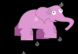
In my first attempt with DUIK I tried to create a rig of a pink elephant with fat stubby legs, and I quickly learned that no amount of tweaking with DUIK's controls, the anchor points or with the separate limb images within the rig would change the fact that stubby limbs don't want to pay nice with DUIK.


I gave up on Nelly the elephant when not only did the joints seem to dislocate and float around improperly, but the knees on the back legs decided to bend in the wrong direction.

I decided to follow a new tack, and thought "Who has really long and skinny limbs?" Giraffes, NBA Players, long distance runners, corpses. Maybe a zombie marathon runner would solve my DUIK woes. Introducing Zomboy:

He knows not why he runs.


Sunday, 4 December 2016

Character and Narrative - Week 9

Things have finally come together, and other than a few very minor tweaks to the timing of a couple scenes the visuals are complete. I have started looking online for royalty free sound effects. I want to use a lot of different sounds and samples to create that tense buildup of confusion and angst. The biggest problem so far has been trying to find samples for the SatNav voice. I might have to resort to actually recording what I need myself, or asking someone to voice-act for me, but I don't think I will be able to make it sound exactly how I want if I use my own recordings. For now I will carry on building up the texture of motorway sounds.

Sunday, 27 November 2016

Character and Narrative - Week 8

This week I made no progress on the project, but I am confident of having it completed on time.

Sunday, 20 November 2016

Character and Narrative - Week 7

Most of the drawn parts of my animation are now completed, scanned in, touched up on Photoshop, and I have begun putting things together in After Effects. I also spent the evening scanning in old maps from a reference book in the library in order to create the content of the SatNav screen before it goes haywire. Essentially all the work for the project is done and all I have to do now is compiling and ordering the individual scenes and finding suitable audio. I want to have ambient road sounds, which build up into a mess of white noise, alongside looping and glitching SatNav sounds.

Sunday, 13 November 2016

Character and Narrative - Week 6

This week I drew frames for around 10-15 seconds of the animation. I have had to cut even more scenes from my storyboards in order to fit into the 30ish seconds time limit.

Sunday, 6 November 2016

Character and Narrative - Week 5

This week I painted lots of road signs. Some are exact replicas of real life signs, and some look like real signs but have unusual imagery on them, for example; alarm clocks, mushroom clouds and dinosaurs. These made up signs will be mixed in subtley amongst the replica signs during the montage sections, and as they will only appear for a second or two I want to create a "Was that a picture of a dinosaur?" moment for the viewer.

Annoyingly my Mac decided it doesn't want to turn on anymore (1 week after warranty ended - coincidence?? I think not. Fuck you Apple). This means I have lost the neat storyboards I drew on Photoshop, as well as the animatic that I made from those storyboards. I still have my rough thumbnails on post-it notes, which are enough for me to outline the story with.

Sunday, 30 October 2016

Character and Narrative - Week 4

This week I made no progress on the animation, but have chosen a character design, and begun collecting images of maps and road signs for reference and use in the montage sections.

Sunday, 23 October 2016

Character and Narrative - Week 3

This week I thumbnailed the story, and began making storyboards. Thinking about the timing of the animation I feel like in order to show the buildup of stress that the driver goes through I will paradoxically have to show less and less of the things that drive him mad in order to allow myself more screentime for the driver himself. Because of this I have scrapped some of my planned montage elements, and will limit the use of the map images to the screen of the SatNav and only use the roadsigns in the visual bombardment the driver undergoes. I have made no progress this week on the actual animating.

Here are some initial development scribbles.

Sunday, 16 October 2016

Character and Narrative - Week 2

This week I settled on a story for my Road to Nowhere animation - it involves a driver whose SatNav breaks, and he struggles to navigate a spaghetti junction style motorway by reading the road signs. The majority of the animation will be black and white traditional hand drawn style, potentially with some limited use of textures. This will make the introduction of brightly coloured road signs and scans of a variety of road maps during the montage sections look even more jarring.

Sunday, 9 October 2016

Character and Narrative - Week 1

For my character and narrative I have picked the title "Road to Nowhere', as I really like the visual quality of maps and road signs. I plan to use lots of map imagery in whatever I decide on for my storyline, potentially using montages of different types of maps.

Tuesday, 4 October 2016

Telling tales -- OUAN504

My first idea for the 30 second Telling Tales animation is for the title "Road To Nowhere". My character will be a driver who is lost and disoriented by a variety of incomprehensible and contradictory road signs. I want to use a mixture of cutout, collage and drawn animation - the character of the driver, his car, and some scenery like roundabouts and background elements will be hand-drawn, whilst the roadsigns which flash in front of his eyes will be handmade, scanned and superimposed using After Effects.

Potentially this video could be looped as the driver never reaches his destination.

Thursday, 5 May 2016

Applied Evaluation -- OUAN406

I feel like Applied was the first module in which I was really happy with the work I completed. My idents both came out very similar to how I pictured them in my head, and I managed to create and find soundtracks which I feel suit them both very well.

I really enjoyed the cutout process - taking the best part of a week to plan it, create all my assets, and tweak the animatic meant that I spent no more than an hour or two animating, not including a few tweaks in After Effects and Premier. It was also fun to record in the sound booth with Dan and Brenda. I think we made a very fitting audio track for the piece. I have a little prior knowledge of sound recording, and we were able to finish everything that I needed very quickly, and with no post-recording editing required.

This module I enjoyed getting into Maya, and am enthusiastic about working in it more in the future. At first glance (and from speaking to second years) it seemed really daunting, but actually modelling and texturing my truck and banana was quite enjoyable, and animating MOOM's walk cycle was very intuitive. I also enjoyed teaching myself more After Effects, and some parts of the National Geographic ident really made me think and stretch myself technically. At the beginning of the module I decided I wanted to do some motion-tracking, or something similar with live-action footage - originally this was going to be for the E4 project, but once I chose the cutout path for that film I had to think of other ways to try and incorporate these techniques, eventually using a myriad of different software and processes. It was satisfying to be able to set myself this challenge at the beginning of the module and then figure out a way of enacting it through the National Geographic ident. This could have resulted in an ident that was all about the technique, but I believe I managed to make something that was suitable to the identity of the brand at the same time. I had worried that both dent's would turn out quite drab and lifeless, but I think I succeeded in adding some vitality to the E4 piece at least with some overlapping action.

For the first time I also felt much more calm and confident during the pre-production stages, and was happy to pursue my ideas to completion, which hasn't always been the case. I got lots of brainstorming out of the way early and made a much more astute decision over what I wanted to work on, before steaming ahead. Perhaps it is because of the more professional style briefs - and the thought ringing in the back of my head that I could potentially submit the E4 ident when they next open their competition - that made me engage more professionally with the tasks. I want to keep this momentum going through summer as I work on my own practice, and hit the ground running next year.

National Geographic sounds -- OUAN406

I was originally planning to have some diagetic sound for each scene in the Nat Geo ident, but after playing around with different audio tracks couldn't get the results I wanted. I have now decided to use some ambient music in the background, and found a nice sample on copyright free site looperman.com which I think suits the feel of the ident quite well.

Tuesday, 3 May 2016

E4 Sound effects -- OUAN406

I booked time in sound booth 1 to record some sound effects for the E4 ident. I used my voice to make screams, comet sfx and an impact explosion. I think using vocal sound effects works with the irreverant tone of E4's output, and the surreal storyline of my ident. I took these recordings and synced them up in Premier.

Friday, 29 April 2016

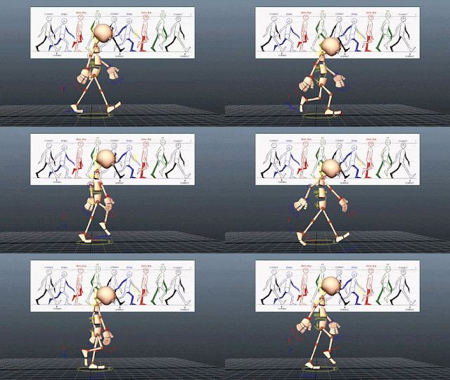
MOOM walking

Using the image plane and Richard Williams' basic walk cycle I have animated MOOM a bit. I found it tricky to get the feet and legs in the positions I wanted because you don;t have direct control of the knee joints.


Tuesday, 26 April 2016

Banana model

The object I chose to model and texture is a banana. I chose it because it isn't a particularly difficult shape to model, but I can go really in depth with the texturing.

I started with a cylinder, added 10 edge loops and dragged the edge rings into a kind of lozenge shape. Then I applied the Bend non-linear deformer to make a gentle banana-like curve.


Then I used a similar process to make a stalk.


Texture


Finished product


Monday, 25 April 2016

Truck Texturing -- OUAN406

Dan has given me some help with unwrapping and texturing my truck in Maya. Im going for a rundown and rusty look, and will add some details like door handles, a grill on the front and maybe a logo or two.


The finished piece:


E4 Completion -- OUAN406

I have done all the animating for the E4 ident, and now just need to edit in After Effects to fix some colour issues from the lighting, and add sound effects. I am currently looking for free SFX online, but may end up recording them myself with my own voice to add to the rough and ready homemade feel already given by the cutout style.

Tuesday, 19 April 2016

E4 Progress -- OUAN406

I decided to animate the E4 ident with cutouts, partly asa challenge and to learn a new skill, and partly because from the previous E4 idents I have seen there were none animated by cutout. I think the story is basic enough to be animated this way, and cutout lends itself well to the style that I drew my storyboard and animatic in.

Saturday, 16 April 2016

National Geographic 3 -- OUAN406

The hardest scene to make in my National Goegraphic ident was the one where the logo appears partially obscured by trees. I didnt want to have to hand paint a mask around the branches for every single frame, so in order to have the trees look as close as possible to the original I had to employ some Adobe wizardry.

First I made the original footage black and white in After Effects, and also ramped up the contrast to make the sky white and the foreground black.


The effect wasn't quite strong enough so I exported the clip as PNG images, and with Photoshop batch processed them into Bitmap PNGs. When I reimported the sequence in after effects it was ready to use as a mask layer.


This could then be applied over the top of the original footage with all the white areas automatically knocked out, leaving me with the desired effect.


I added a very gentle pan to the rectangle object, in the opposite direction that the trees are moving, to give the impression that the camera is rotating around the logo, and used the After Effects "Color Change" to make the logo look like it was being illuminated by the same light source as the trees.


Final Result:


Thursday, 14 April 2016

National Geographic Progress -- OUAN406

I have placed my Maya model into two scenes so far and continue to look for more diverse environments to use.


Wednesday, 13 April 2016

National Geographic Progress -- OUAN406

I have made a model of the National Geographic yellow rectangle in Maya, and begun looking for nice footage to place the model into. I hope to use a mix of shots including still and moving camera - so some scenes will require me to animate the model, whereas others I can simply use a still render and impose that into the video.


Tuesday, 12 April 2016

National Geographic -- OUAN406

I have decided to scrap the intial idea of the spinning globe, and instead go for the second concept of placing the logo rectangle into various different environments. I think my initial idea would look great, but the time it would take me to animate does not leave me with much time to work on E4, and this way I also get the chance to do something other than hand drawn animation. I still like the concept, and would like to use it in a future project if the chance arises.

National Geographic Concept 2 -- OUAN406

I am still interested in utilising motion tracking or other techniques to impose images into live action footage, and would like to try to impose the yellow rectangle of the National Geographic logo into various different scenes from all around Earth. This would include cityscapes, rainforests, mountain ranges, beaches, arctic tundra etc. I would like to use timelapse footage preferrably as I like the effect, and it also gives a sort of voyeuristic sense to the footage which I think works well for a TV channel whose main output is documentary programming.


Saturday, 9 April 2016

National Geographic Channel Ideas -- OUAN406

National geographic channel has a wide range of documentary programming focusing on all elements of the earth. Many of these shows are straight up documentaries about social or cultural subjects, for example current series "God" with Morgan Freeman, which looks at the way various modern and historical cultures and religions think about life, death and other religious isues, or "Sea Monsters: the definitive guide" which talks about various real and legendary sea creatures. Other programs follow a more reality-show kind of format, for example "The Great Human Race" in which two archaeologists trace the steps of neolithic people migrating to North America.

The element of their programming that I want to focus on is the broader look at the Earth, and I want to represent the fact that their shows discuss people, places and events from across the entire planet (and outer space).

My initial concept was to create some sort of slideshow, with images from all corners of the Earth. The idea is to display the wide range of subjects shown on the channel, but I am struggling to think of an interesting way to animate this.

I remembered seeing a music video (https://vimeo.com/88360151) which used multiple GoPros mounted on a drone, and when the footage was stitched together it created a miniature globe effect. I thought it would be really nice to have an overhead view of a rotating planet, and every second or so a new environment or ecosystem would appear over the horizon.


The effect would hopefully turn out like this footage from the International Space Station:

Wednesday, 16 March 2016

Visual Language Self Evaluation -- OUAN404

In which I complain about the same thing I have complained about in my previous two evaluations:

During this module I think I didn't push myself as hard as I could in terms of creativity. The Set, Series, Sequence task ended with some quite tame drawings of hats, in a style that I hadn't really developed. Once again I think initially starting to think of ideas for hats I didn't come up with many ideas that were much more than just quite plain illustrations, and then when I had an idea for the final animation, ended up drawing things which fit into that idea rather than continuing to try and explore. I often find it hard not to think about the end product straight away, and end up drawing things for a pre-determined outcome instead of playing around with different ideas and working out which ones work best. This is definitely what happened during Set, Series, Sequence in which the first frame of my final storyboard came into my head as soon as I began drawing hats, and didn't change much after that. I had a very strong mental image of it, but actually I think the rest of the storyboard turned out quite weak.

Similarly in Captain Character, after playing with primitives briefly and coming up with a few different characters that way, I decided on making a pirate. Very quickly I settled on a rough design and had to force myself to go back to the first stages of design, eventually ending up with lots of pirates of varying levels of menace - but still couldn't get my first idea out of my head, and the final product came out quite similar.

At the same time it is beneficial that I often have very strong ideas as soon as getting a brief - it means I can get to work very quickly, sometimes with a clear direction of where I want to go, but also a weakness which more often than not stops me from properly working out that direction before heading off.

I also struggled with blogging during this module. I feel sometimes like the blogging tasks in our briefs are very much geared to people who watch lots and lots of cartoons or animated films, and have an encyclopaedic knowledge thereof. When asked to "explore 3 animations and critically analyse them and identify how their use of composition, lighting, tone, texture, form, space and composition etc begin to tell an environmental story"(for example) I find it hard to think back over things I have already watched, and never get that "Oh, this film has a great use of ... " moment. I often find myself blindly trawling through the internet to find animations which particularly fit into a writing brief. I'm not sure whether it is my own interests, those of the course (or the majority of students the course sometimes feels geared to), or something else that made me find it this difficult.

Of all the modules this year, including Applied, PPP and COP, I have enjoyed Visual Language the least, in large part because of the work I produced not being quite as adventurous as I feel I should be. As I write this I am looking at a folder of work that, other than maybe one or two life drawings (a subject which I was already confident and comfortable in), I am not particularly proud of.

Monday, 14 March 2016

Warehouse drawings -- OUAN404

Tried a few different things with my drawings from the warehouse in woodhouse. Unlike the Abbey drawings whese have been scanned and played with in Photoshop to introduce textures and different colourings, or created completely digitally from reference photographs

pencil, watercolour and photoshop

fine liner and photoshop
photoshop brushes and textures

photoshop textures and blending layers

photoshop brushes and texturing

Favourite Cartoon Characters: Iron Giant -- OUAN404

The Iron Giant is a masterclass in how to display emotion in a character with very limited speech and minimal facial expression. Using only the tilt of his head, shape of his eyes, and the set of his jaw the giant robot can display a wide range of emotions. It is probably a testament to how people are able to anthropomorphise non-humans, that both Hogarth and the audience can empathise with the robot, but also down to smart design. These key elements of facial expression and body language - the mouth, eyes, and neck - are maybe the bare minimum required to properly tell the audience how the character is feeling, in the same way that Gromit uses his one dynamic eyebrow to such great effect. The robot also looks just futuristic enough to be impressive and still fit in seamlessly to the 1950s cold war setting of the film, but without resorting to obvious 50s sci-fi conventions like aerodynamic fins or rockets, or shiny glossy paintwork like was seen in "futuristic" car designs of the era.

looking angry

looking curious

looking sad

Favourite Cartoon characters: Rorschach -- OUAN404

Rorschach, the psychopathic masked detective from Watchmen is one of my favourite characters from a graphic novel. His design encorporates the trenchcoat and hat typical of the hardboiled pulp detective characters that he was based off - a tip to the parallel 1940s and 50s America in which Rorschach and the other Watchmen were most active. The most obvious feature is obviously his mask, representing the Rorschach tests which he takes his name from - and hinting at his extreme mental health issues which are revealed throughout the story, as well as his views that morality is a black and white issue with no grey areas. I like his design for a few reasons, partly just because I am a fan of the film noir genre and the tough private detective characters often found in those films, partly because the idea of a mask with constantly changing patterns is just really cool on its own.


rorschach blot test


Wallace Design Changes -- OUAN404

A sweet story I found on Living Lines Library about ow the design of Wallace developed. Originally Nick Park designed a straighter jawline, but when Peter Sallis exaggerated the word "cheeeese" during recording of the vocals it was decided to widen Wallace's jaw to reflect his elongated E sounds. It is funny that Aardman are now associated with that wide-mouthed toothy style that many of their characters share, when it was a last minute design edit that originally gave Wallace the look. You also wonder whether or not the design, which is unique and distinctly Wallace-y, played a part in the success of the franchise, as it makes Wallace much more memorable.

Pre and Post-Cheeeese Designs


Hercules Character Design -- OUAN404

Disney's Hercules has the really interesting quirk of using design that is reminiscent of artwork from Ancient Greece where the story originated (albeit in a highly stylised way), and yet they manage to still look like characters in a Disney movie. Character designs in particular incorporate many elements from Greek art, in particular the painted vases and bowls that famously depict their myths and legends. The main character Hercules in particular shows many design elements lifted from this art, for example the way his straight nose runs into his forehead without a crease, and the decorative swashes and curls that outline his muscles.


Hercules' father Zeus sports a pointy triangular beard, exactly the same as is found in many Greek paintings, and wears long white robes with lots of overlapping folded fabric, another common image in the Greek art.