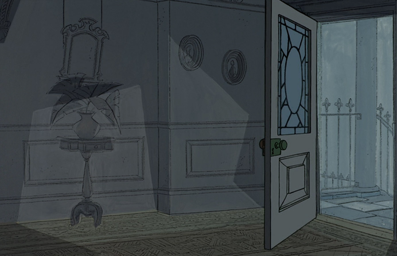
The beautiful backgrounds in Disney's
101 Dalmatians (1961) were quite a departure from the styles of previous Disney feature lengths, using lots of angular blocks of colour and much more straight lines in a style that would later become synonymous with 1960s graphics. There is also a really sketchy use of overlapping colour, where the fill from one object or detail in a scene spills out of its outline, which looks nice in general - but works especially well on the wet streets of London where the overlapping blocks of colour suggest reflections in the rain on the paving slabs and road surface. The watercolour washes also produce a lovely foggy effect, as London was famous for its thick smog in the 1950s when production would have begun. The contrast between the colour schemes inside Roger and Anita's house - all warm reds and browns, and other colours in high saturation - and Cruella DeVil's mansion, depicted in cold greys, greens and blues, as well as eerie pale yellow lighting also helps suggest Cruella's evil nature, in opposition to the warm and loving household that the Dalmatian pups must return to.


No comments:
Post a Comment